A personal project that began in 2019 when we made a field study about typefaces used in educational books for learning to read, created by the Ministry of Education in Mexico. From this research, we realized some premises and details that would help facilitate first reader’s learning to read. From there, we have designed a typeface with the purpose to enhance the reading learning experience during our residence at Hoffmitz Milken Center for Typography, in February 2021.
We proposed to include certain differentiating features in a controlled way, that can help the reader to better recognize the characters, at first sight.
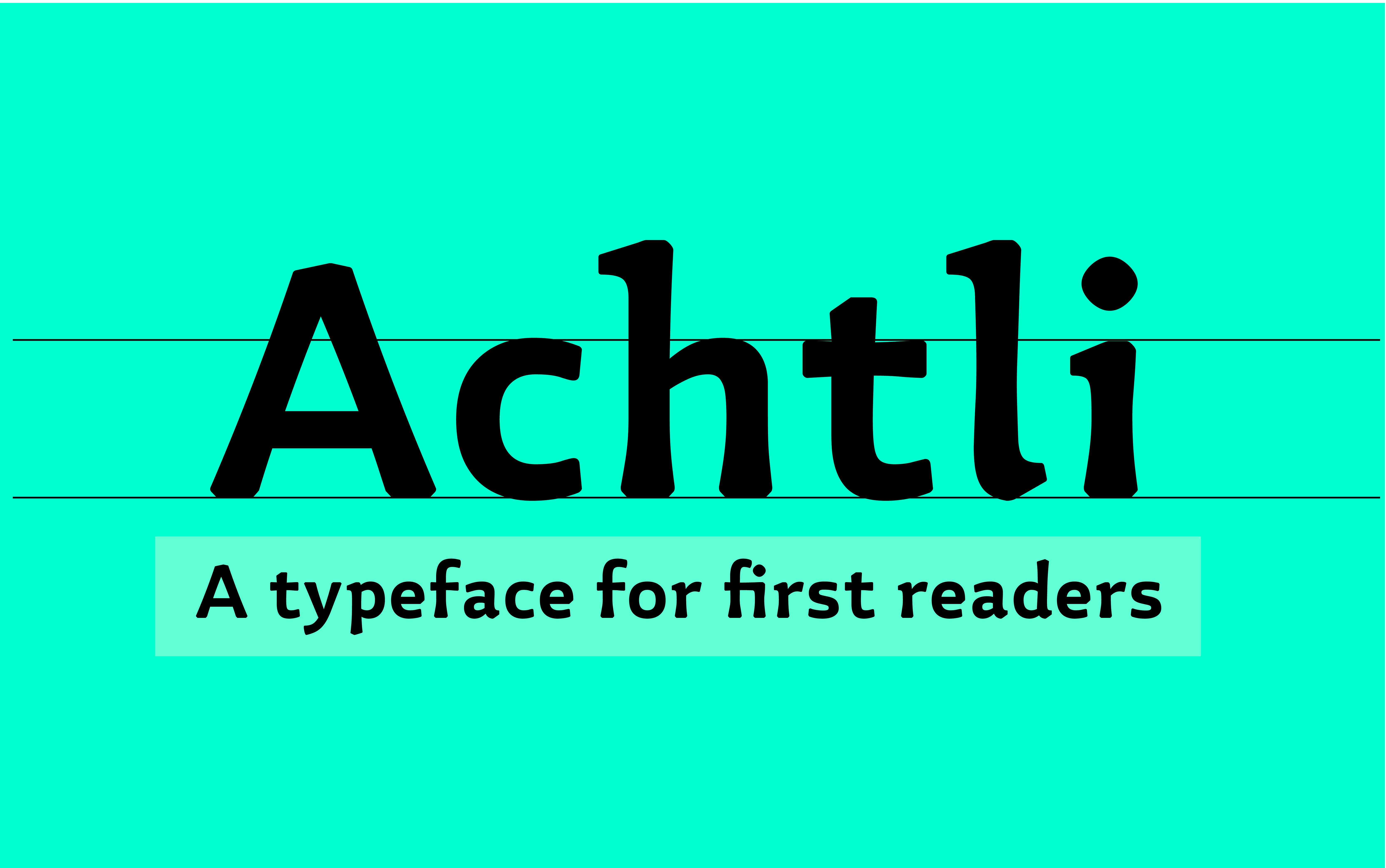
Under that idea Achtli is born, its forms have a moderate contrast and semi-serif endings that allow a clear identification of the characters, slightly flared stems to emphasize the weight on the finishes, moving away from the homogeneity of the geometric fonts used in this kind of books. We also proposed warm and modern shapes, with fractured and rounded ends that allow the font a strong but close personality, generating empathy with the reading public.
Detached from the need to connect typography with other knowledge fields involved with the learning to read process like pedagogy and publishers we have extended the project to develop a complete typeface family with an extended character set ideal to design print and digital publications for first readers.
The second extension of the project leads to a font that is at the same time a didactic material. Achtli didactic is an easy-to-use game and an easy-to-play typeface, created to help first readers to read, write and make fun reading, recognition, and memorization during that learning process.
Personal Project
April 2021